Momentum Indicators in Momentum Trading and how to Read them

To understand the concept of Momentum trading, lets start with an example,
“Lets say there is a company named “TechCorp," that has just released a groundbreaking product. Initially, a few analysts and traders start buying shares based on positive news, leading to a modest price increase.
As TechCorp’s stock price starts to rise, more traders notice the trend. Influential financial news outlets begin covering the stock, highlighting its potential. This attracts attention from retail investors and institutional traders alike.
That’s the beginning of Herd Behavior
Seeing the stock's momentum and the positive media coverage, a larger group of investors rushes to buy shares, fearing they might miss out on potential profits. The price continues to climb rapidly as demand increases.
As the price surges, more traders join in, believing that the momentum will sustain itself. Technical indicators, such as the RSI and MACD, confirm bullish signals, further encouraging the herd mentality.
Eventually,
the stock reaches an overbought level, and some traders begin to take profits. Once a few significant sell orders come in, the price starts to decline. Seeing the decline, other traders panic and sell, exacerbating the downward momentum.
Then begins a Downward Spiral
The herd mentality now works in the opposite direction. As more investors sell, the stock's price plummets, reinforcing the decision for others to exit their positions.”
Momentum Trading takes advantage of this Herd Mentality
What is Momentum Trading?
Momentum trading capitalize on the strength of price trends. Traders seek to capitalize on the upward momentum of securities by buying them early in their price appreciation cycle and selling them before the trend reverses. This strategy is built on the premise that momentum breeds further momentum; thus, a stock on the rise is likely to keep rising, while a declining stock is expected to continue its downward path and thus it present viable trading opportunities.
How to Identify Momentum Trading Opportunities?
Instead of analyzing a company's fundamentals, momentum traders rely heavily on technical analysis to identify and exploit short-term price movements. This strategy can be applied to various markets, including stocks, forex, and commodities.
In the blog post below, we will discuss top 3 Indicators that can be used to identify momentum trading opportunities. We will also learn how to read the related charts for this technical analysis.
So Let's Go!
Top 3 Momentum Indicators
Several technical indicators can help traders identify momentum. We disucss 3 of them below so that you can an idea of how to use them.
1. Moving Average Convergence Divergence (MACD)
MACD compares two moving averages to identify trend changes and potential reversal signals. It consists of three components:
- MACD Line: This is the difference between a longer-term and a shorter-term moving average. A common combination is a 12-period and 26-period exponential moving average (EMA).
- Signal Line: This is a 9-period EMA of the MACD line.
- Histogram: This is the difference between the MACD line and the signal line.
for So, How does MACD provide momentum trading Opportunities?
Well,
MACD can help identify potential trend reversals and changes in momentum in a variety of ways.
MACD can be used for Trend Confirmation
When the MACD line crosses above the signal line, it's often considered a bullish signal, indicating that the price is likely to continue moving higher.
and, when the MACD line crosses below the signal line, it's often considered a bearish signal, indicating that the price is likely to continue moving lower.
MACD is also used to identify Divergence
If the price is making new lows, but the MACD is making higher lows, it could indicate a bullish divergence, suggesting that the downtrend may be losing momentum.
Conversely,
If the price is making new highs, but the MACD is making lower highs, it could indicate a bearish divergence, suggesting that the uptrend may be losing momentum.
And how do you identify Momentum Strength?
Through Histogram.
A histogram provides a visual representation of the strength of the momentum. A higher positive histogram indicates stronger upward momentum, while a higher negative histogram indicates stronger downward momentum.
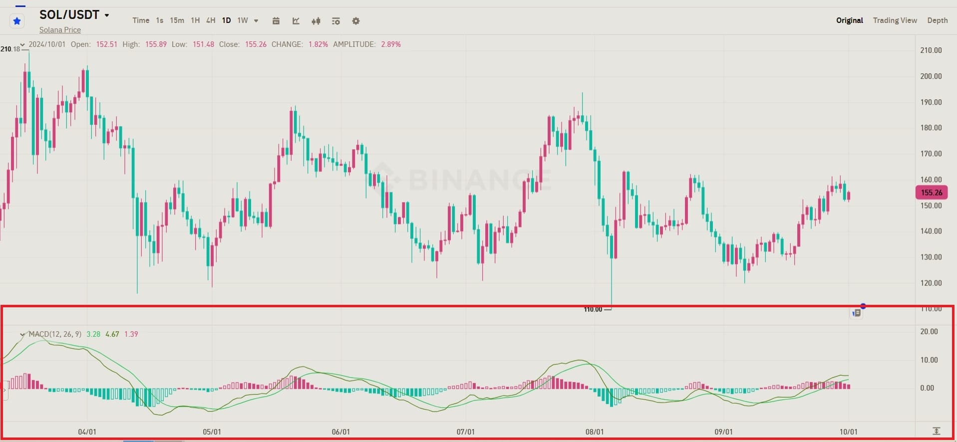
For Example,
Lets have a look at this SOL/USDT chart below from Binance.
In this chart you can see,
Around mid-August, there's a bullish crossover, where the MACD Line (pink) crosses above the Signal Line (purple), suggesting a potential buying opportunity.
This coincides with a price increase from the August lows of around $110 to the current price of $155.26.
From mid-June to July, there was a clear bearish crossover, where the MACD Line stayed below the Signal Line, which is reflected in the price drop from around $180 to $110
The MACD is currently showing the histogram with green bars, indicating that the MACD Line is above the Signal Line. The distance between the MACD Line and the Signal Line is relatively small, suggesting that the bullish momentum is moderate but not particularly strong.
2. Stochastic Oscillator
The Stochastic Oscillator measures the position of a security's closing price relative to its high-low range over a specific period. It is based on the assumption that prices tend to close near the extremes of their recent trading range during strong trends.
The Stochastic Oscillator consists of two lines:
the %K line and the %D line.
%K line: This line represents the current closing price relative to the high-low range over a specified period (usually 14 days). It is calculated as follows:
%K = 100 * ((Close - Low) / (High - Low))
Where:
- Close is the current closing price
- High is the highest price during the specified period
- Low is the lowest price during the specified period
%D line: This line is a three-day simple moving average of the %K line. It is used to smooth out the fluctuations of the %K line.
How does Stochastic Oscillator Identify momentum trading opportunities?
The Stochastic Oscillator identifies momentum trading opportunities by indicating overbought and oversold conditions, as well as through divergence and crossover signals.
Overbought and Oversold Conditions:
When the %K line rises above 80, it suggests that the asset is overbought, meaning it has been rising rapidly and may be due for a correction. This could be a potential selling opportunity for momentum traders.
When the %K line falls below 20, it suggests that the asset is oversold, meaning it has been declining rapidly and may be undervalued. This could be a potential buying opportunity for momentum traders.
Divergence:
Divergence occurs when the %K line moves in a direction opposite to the price. For example, if the price is making new highs but the %K line is making new lows, it could indicate a potential reversal of the uptrend. This could be a signal for momentum traders to exit their long positions or potentially short the asset.
Crossovers:
Crossovers between the %K and %D lines can also be used as trading signals.
A bullish crossover occurs when the %K line crosses above the %D line, suggesting a potential uptrend.
A bearish crossover occurs when the %K line crosses below the %D line, suggesting a potential downtrend.
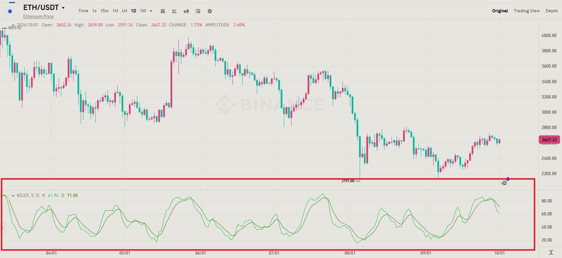
For Example,
Take a look at the following ETH/USDT Chart
The Chart shows some Bullish Crossovers (when K crosses above D) occurring around the June low, aligning with a price increase from around $2,100 to $2,600.
The Bearish Crossovers (when K crosses below D) happened during the July to August decline, leading to a fall in price.
Currently, the K is standing at 61.94 and D is standing at 71.00.
What does this say about the current situation?
Since K is below D, it suggests that a bearish trend could be emerging, or at least the bullish momentum is weakening.
The chart shows that the K line has crossed below the D line after a recent upward trend. This suggests that the bullish momentum may be fading, and the market could see either sideways action or a potential pullback.
3. Rate of Change (ROC) or Momentum Index (MTM)
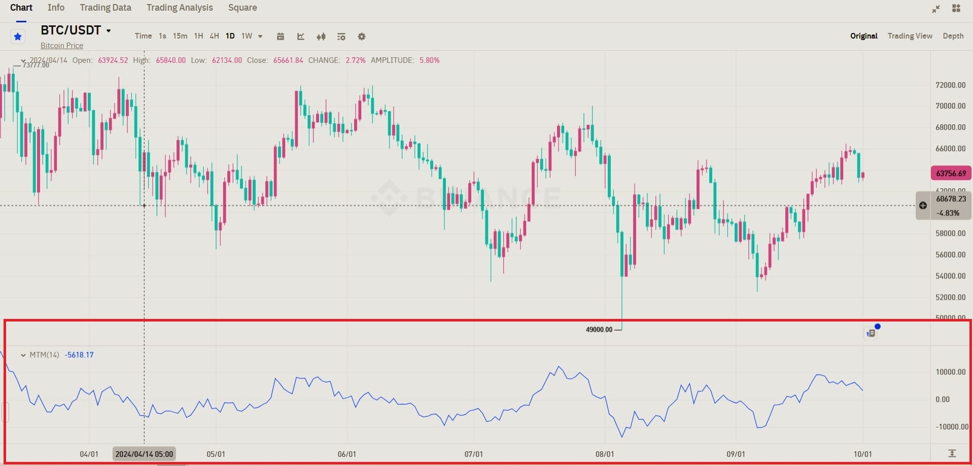
Rate of Change (ROC) or momentum Index, measures the percentage change in price over a specific period. It helps identify the speed and direction of a trend.
ROC = ((Current Price - Previous Price) / Previous Price) * 100
A positive ROC indicates that the price is increasing. The higher the positive value, the faster the uptrend.
A negative ROC indicates that the price is decreasing. The lower the negative value, the faster the downtrend.
A zero ROC indicates that the price has not changed.
Using Rate of Change (ROC) to Find Momentum Opportunities
ROC can be used for Trend Confirmation
A consistently positive ROC confirms an uptrend. A consistently negative ROC confirms a downtrend. If the price is making new highs or lows, but the ROC is not, this could indicate a potential reversal.
ROC also indicates Overbought/Oversold Conditions
A very high positive ROC could suggest that the asset is overbought and may be due for a correction. While, A very high negative ROC could suggest that the asset is oversold and may be due for a rebound.
This helps Identifying Breakouts. A sudden, sharp increase in ROC can signal a potential breakout from a resistance level. While, A sudden, sharp decrease in ROC can signal a potential breakdown from a support level.
Comparing ROC to Price can also reveal some useful insights.
If the ROC is diverging from the price (e.g., the price is making new highs but the ROC is declining), it could indicate a potential trend reversal.
For Example,
Let's take an example from the BTC chart below where the momentum index is the line in Yellow;
Ok, So what does this ROC line tell us?
Quite a few things actually!
1. Negative Momentum (Bearish) Around Mid-April to Mid-May: The Momentum Index dips significantly below zero, reflecting a strong bearish phase where BTC/USDT prices declined. This matches the significant drop visible in the candlestick chart.
2. Recovery Phase (June to August): The momentum recovers, moving back into positive territory. This indicates a shift to bullish momentum, correlating with the price recovery and upward trend seen on the candlestick chart during this period.
3. Recent Weakening Momentum (August to October): The momentum has begun to decline again, although still in positive territory. This signals that the upward price movement is losing steam, and there may be a potential reversal or consolidation ahead.
Conclusion
In conclusion, Momentum trading can be a profitable trading strategy based on the concept of Herd Mentality. By identifying and capitalizing on the upward or downward momentum of securities, momentum traders aim to capture gains before the trend reverses. Indicators like the MACD, Stochastic Oscillator, and ROC can help identify potential momentum opportunities and assess the strength of trends.
However, Understanding the limitations of momentum trading is essential. This strategy is often short-term focused and can be highly volatile. It's important to manage risk effectively and diversify your portfolio.
Trade Smarter!