How to Learn Technical Analysis in 4 Steps

Traders use technical analysis because they believe the market can be compared to... a coin toss!
Think about it.
When you flip a coin, there's a 50/50 chance it will land on heads or tails. But if you flip the coin 10 times in a row and get heads each time, wouldn't you be more likely to think the next flip will also be heads?
Technical analysis is similar.
By studying past price movements and patterns, traders try to understand the "psychology" of the market and guess which way the "coin" might land next.
Traders love using technical analysis because it zooms in on how a stock's price moves.
Since their main goal is to make money from these price changes and trends, technical analysis becomes their go-to tool for understanding and reacting to these movements.
Why Technical Analysis Matters?
Technical analysis helps predict where prices might go.
By knowing the chances and size of possible price changes, traders can set goals for their trades.
With technical analysis, traders can figure out a stock's trends and critical levels like support (where prices usually stop falling) and resistance (where they typically stop rising).
So that they can time their entries and exits
By using indicators that show how fast prices change, traders can tell when a stock is being bought or sold too much.
These indicators can signal when a price trend might turn around, helping traders decide when to jump in or out of a trade.
It also lets traders put numbers on their goals and the maximum amount they're willing to lose.
For example, they might only take trades that could make them twice as much as they might lose.
By knowing these numbers, traders can adjust their plans to stay safe. For instance, if a stock has the potential to go up by $1 but might drop by 50 cents, meeting the two-to-one criteria, traders can plan accordingly.
How to Learn Technical Analysis:
Learning technical analysis can be broken down into four simple steps.
- Get to know stock charts.
- Understand technical indicators.
- Learn stock chart patterns.
- Put your knowledge into action.
Step 1: Get to know stock charts.

Stock charts might seem intimidating at first glance, but
The First Step of Technical Analysis involves
Understanding the Basics! The Stock Charts.
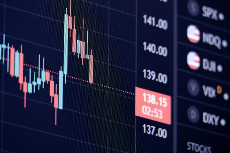
Stock charts are the foundation of technical analysis. They display the price movements of a stock over time; here are the most basic things a stock chart has:
Price Axis (Y-axis): Represents the stock's price at different points in time.
Time Axis (X-axis): Represents the timeframe for which the chart displays data (e.g., days, weeks, months).
Bars/Candlesticks: These visual elements depict the stock's price movement over a specific period. Each bar/candlestick usually represents a day's trading activity.
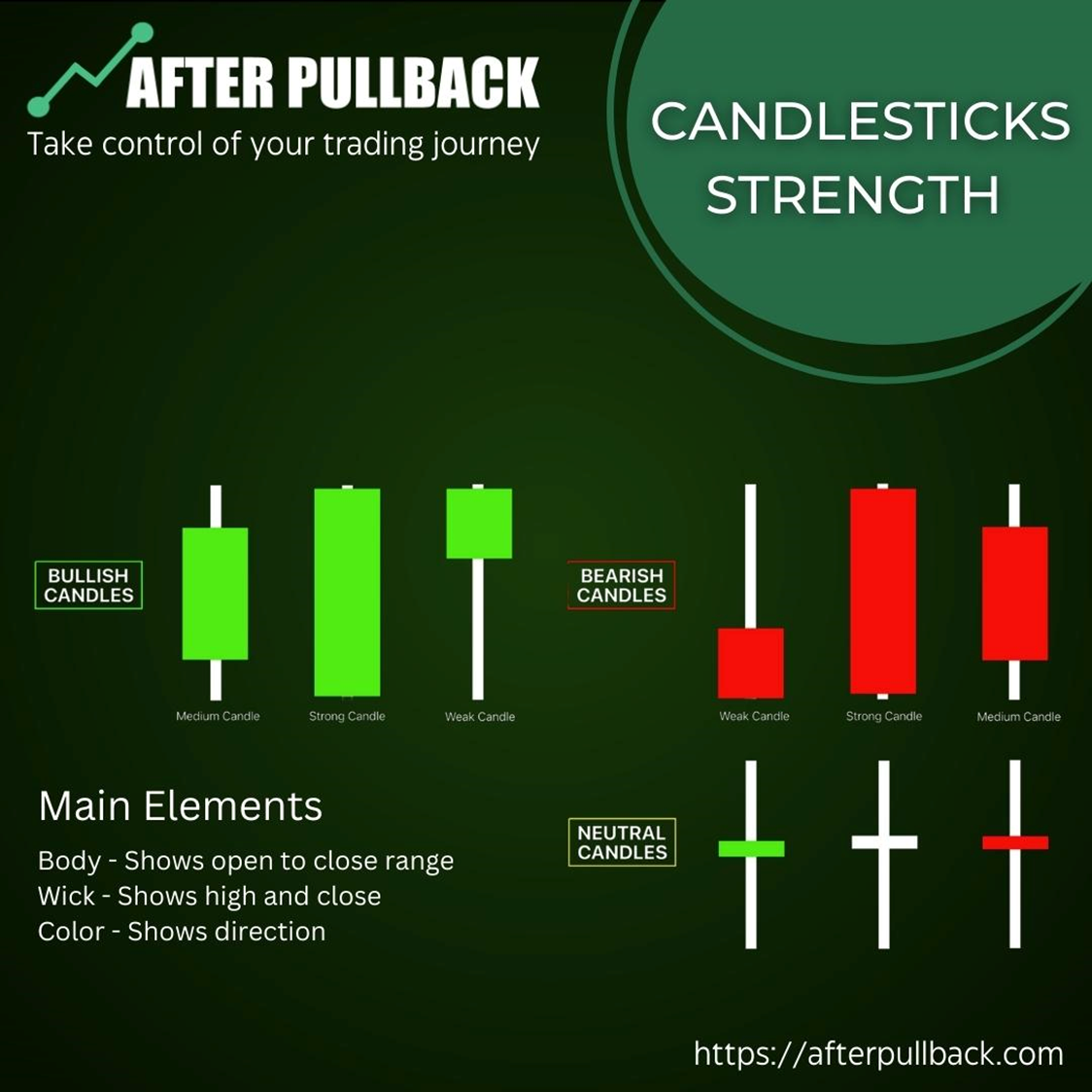
Do you see the Red and Green candle-like figures on the chart?
These are the building blocks of Charts.
These show how a stock's price moves throughout the day, with the body indicating the opening and closing prices.
Some platforms use different colors for candlesticks. Green (or white) generally indicates a closing price higher than the opening price (upward movement). At the same time, red (or black) represents a closing price lower than the opening price (downward movement).
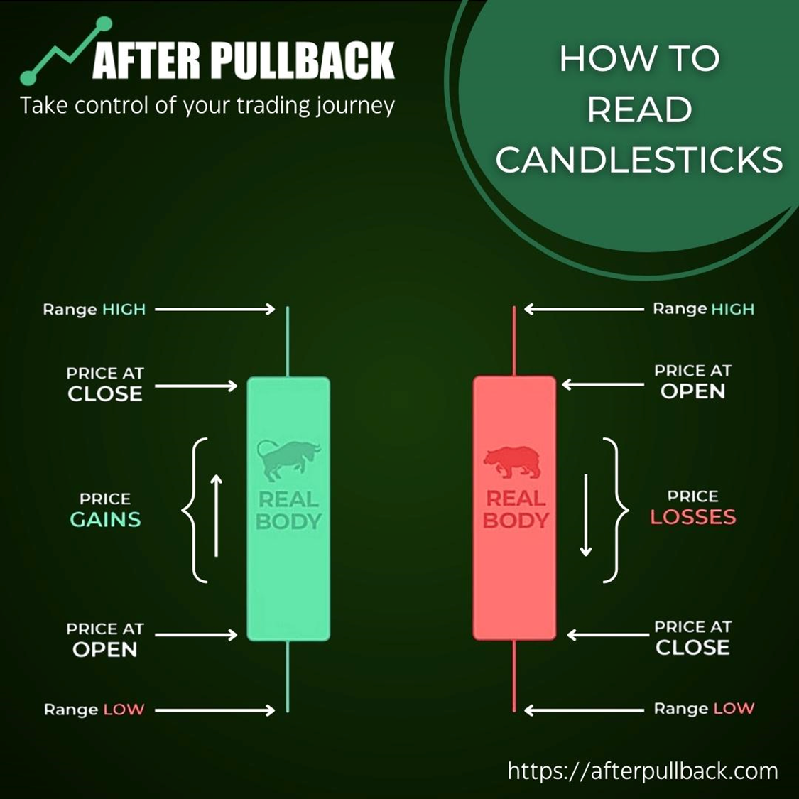
A Candlestick is more than a color code; Its shape tells you much more!
- Open: The price at which the stock opened for trading during the period.
- High: The highest price the stock reached during the period.
- Low: The lowest price the stock reached during the period.
- Close: The price at which the stock closed for trading during the period.
Another critical aspect of the Stock Chart is
Different Time Frame Options
You can consider your stock chart as a landscape painting. You can view it from afar to see the broad strokes and overall trends or zoom in on specific areas to examine the finer details. Time frames on charts function similarly:
Short-Term Time Frames (e.g., 1 minute, 5 minutes, 15 minutes): These charts display price movements over very short periods. They're ideal for day traders who want to identify quick trading opportunities based on rapid price fluctuations. However, the abundance of detail can be overwhelming for beginners.
Intraday Time Frames (e.g., 30 minutes, 1 hour, 4 hours): These charts balance short-term and long-term views. They allow you to see the price action throughout the trading day while filtering out more erratic movements.
Daily Time Frames: This is a popular choice for many traders. Daily charts show each day's opening, high, low, and closing prices, providing a clear picture of the overall price trend.
Weekly and Monthly Time Frames: These charts condense price movements into weeks or months. They help identify longer-term trends and potential support and resistance levels (where the stock price might have difficulty breaking above or below).
Choosing the Right Time Frame:
The ideal time frame depends on your trading style and goals:
- Day Traders: Focus on short-term time frames to capitalize on intraday price movements.
- Swing Traders Often use daily or intraday charts to identify opportunities that might play out over a few days or weeks.
- Long-Term Investors: Utilize weekly or monthly charts to focus on long-term trends and make investment decisions based on company fundamentals and broader market conditions.
You can also use multiple time frames to improve your trading results
Step 2: Understand Technical indicators.
Once you can read the basic language of charts, you need tools to analyze the information in more detail.
This is where technical indicators come in.
Think of them as translators that help you understand the deeper meaning behind the price movements.
Indicators can reveal:
Trends: Are prices consistently rising (uptrend), falling (downtrend), or fluctuating sideways (consolidation)? Moving averages, trendlines, and MACD (Moving Average Convergence Divergence) are popular trend indicators.
Momentum: Is the price movement gaining steam (strong momentum) or losing traction (weak momentum)? RSI (Relative Strength Index), Stochastic Oscillator, and Bollinger Bands can provide insights into momentum.
Support and Resistance: These are price levels where the stock might encounter buying or selling pressure, potentially causing the price to bounce or stall. Support and resistance zones are often identified using historical price data and technical analysis tools.
Overbought/Oversold Conditions: Some indicators, like RSI, suggest when a stock might be overbought (priced too high) or oversold (priced too low) based on recent price movements. However, remember, these are not guarantees of a reversal, and the stock might continue trending in the same direction.
And there can be many types of Indicators,
- Price Indicators delve into the relationship between a stock's current price and its historical prices. Moving averages, which smooth out price fluctuations to reveal the underlying trend, and support/resistance levels identified through historical analysis are prime examples.
- Momentum Indicators: These indicators focus on the speed and direction of price changes. RSI, Stochastic Oscillator, and Average True Range (ATR) all fall under this category, helping traders gauge the strength of a price movement.
- Volatility Indicators: Bollinger Bands, for instance, not only depict trading ranges but also indicate volatility. When the bands narrow (squeezing), it might suggest a potential breakout. Conversely, widening bands (spreading out) could signify increased volatility.
Understanding these indicators allows you to interpret the chart beyond just the price movements. They give you valuable insights into potential trends and trading opportunities.
But remember,
It would help if you had the foundation of chart knowledge (step 1) to understand where to apply these indicators effectively.
Step 3: Learn stock chart patterns.
Step 3 of your technical analysis journey focuses on understanding stock chart patterns.
These recurring formations on charts act like signposts, offering clues about potential future price movements.
Patterns help you identify structure within the seemingly random price movements. They act like recognizable shapes or formations indicating a potential pause, reversal, or continuation in the price trend.
There are numerous chart patterns, each with its interpretation and potential implications. Here's a closer look at some common ones:
Reversal Patterns:
These patterns suggest a potential shift in the prevailing trend. Here are a couple of examples:
Head and Shoulders: This pattern resembles a head with two shoulders, often seen at the peak of an uptrend. It can indicate a potential reversal to a downtrend. Imagine reaching the summit of a mountain (uptrend), followed by two smaller peaks (shoulders) before the descent begins (downtrend).
Double Tops/Bottoms: These patterns appear as two consecutive highs or lows that the price struggles to break above/below. They can suggest a potential trend reversal, with a double top hinting at a shift from uptrend to downtrend and a double bottom suggesting a change from downtrend to uptrend. Think of them as reaching a plateau (double top) or a valley floor (double bottom) before the price direction changes.
Continuation Patterns:
These patterns suggest the current trend might continue after a brief pause. Here are a couple of examples:
Flags and Pennants: These patterns resemble flags or pennants, with converging trendlines on either side. They often occur within an established trend and indicate a potential continuation after a short consolidation period. Imagine a brief rest stop (consolidation) during a hike (trend) before continuing on the same path.
Triangles: These patterns form triangles with converging trendlines, either ascending (pointing upwards) or descending (pointing downwards). They can indicate a potential breakout from the trend in the direction of the dominant trendline. Think of them as converging mountain ridges (ascending triangle) or valleys (descending triangle) leading to a potential breakthrough point.
If you want to learn more, We have Compiled here 10 Common Chart Patterns That Every Trader Should Know Of
But the Important Question is,
Why do Chart Patterns Matter?
Understanding Chart Patterns is necessary for
Improved Trend Identification
Patterns can help confirm or refine your understanding of the prevailing trend. For example, a head and shoulders pattern appearing at the peak of an uptrend might strengthen your belief in a potential reversal.
They also help in
Identifying Potential Entry/Exit Points:
Some patterns, like double tops/bottoms or breakouts from triangles, suggest areas where the price is vulnerable to a reversal, potentially offering entry or exit points for trades.
Here are a couple of Fun Facts about Chart Patterns
Step 4: Put your knowledge into action.
Technical analysis is a skill, and like any skill, it requires practice to master.
Reading about chart patterns and indicators is valuable. Still, the real test comes when you apply that knowledge to real-world scenarios.
Here are some ways to gain practical experience:
Paper Trading:
This is a risk-free trial run for real-world trading.
Many online brokers and trading platforms offer paper trading accounts. These allow you to simulate trading with virtual currency, mimicking real-world market conditions.
You can use paper trading to:
Test Your Strategies: Apply your chart-reading and technical analysis strategies to identify potential trading opportunities.
Manage Your Risk: Practice proper risk management techniques, such as setting stop-loss orders to limit potential losses.
Develop Your Trading Psychology: Paper trading allows you to experience the emotions of trading without risking real money. This can help you develop discipline and emotional control, essential for success in the real world.
Backtesting:
This involves testing your technical analysis strategies on historical data.
Backtesting allows you to see how your strategies would have performed in the past, given certain market conditions and price movements.
While past performance doesn't guarantee future results, backtesting can help you:
Refine Your Approach
See how your chosen indicators and chart patterns performed historically. This can help you identify strengths and weaknesses in your strategy, allowing you to refine it before risking real capital.
It also makes you Set Realistic Expectations.
The market is unpredictable, but backtesting can give you a sense of how your strategy might react to different market scenarios.
Live Trading (with Caution):
Once you're comfortable with paper trading and backtesting, you can consider venturing into live trading with real money. However, this step should be approached with extreme caution:
Start Small
Begin with small trade sizes to minimize potential losses while you gain real-world experience.
Prioritize Risk Management
Always have a risk management plan in place, including stop-loss orders and position sizing strategies &
Most Important,
Manage Your Emotions
Trading can be emotionally charged. Stick to your plan and avoid making impulsive decisions based on fear or greed.
Remember
Continuous Learning is Key:
The world of finance is constantly evolving, and so should your technical analysis skills. Stay updated with market trends, new technical indicators, and changing strategies.
By following these steps and constantly honing your skills, you'll be well on your way to becoming a more informed and confident technical analyst, equipped to navigate the exciting yet challenging world of stock trading.
So,
Best of Luck for your Technical Analysis
&
Trade Smarter!